What about the 87 students from Hillsdale College in Michigan who watched a UFO for hours from their dorm in 1966? And what about the numerous errors that continue to appear in books about extraterrestrial life, including inconsistent spellings of certain key names in the history of astronomy? And the secret radar jamming in 1960 to interrupt signals from space, perhaps to prevent the Soviets from acquiring alien technology? Accidents? Coincidence? Delusion? To clarify these events in advance of the landings, which are surely imminent, we had best consult the work of Ken Grimes. For nearly 40 years, Grimes has been making paintings and drawings, many in monochrome black and white, that examine the evidence of phenomena just beyond the ken of human science. With ominous titles like What’s the frequency? (1997), a probable reference to the 1986 assault on newsman Dan Rather, and text-heavy renderings of everything from galactic radio maps to figures borrowed from Edvard Munch’s The Scream (1893), Grimes’s paintings define a territory between document and paranoid fantasy, between photography and fine art.
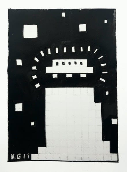
Although the exhibition at Ricco/Maresca contains mostly smaller works on paper—drawings and gouaches—it may be the most revealing presentation about the motives of this prolific artist. It is illuminating as well, not only about Grimes but also about the strategies of a range of artists on the visionary spectrum, from Alfred Jensen and his obsession with Mexican pyramids to Johannes Itten, who founded the Bauhaus design program, to Emery Blagdon, the outsider who created a barn full of healing machines. Grimes has always tended to work in visual shifts, adopting different design variations of his black and white schemes. Previous exhibitions, for example, have featured large panels containing nothing but text. As an artist, Grimes does not develop so much as adopt different formats, seemingly arbitrarily. Next week, he is just as likely to paint a 16-foot painting. This exhibition, though, marked the first appearance of color in his work—simple geometric forms of red, yellow, and blue, positioned in fields of binary dashes and dots. Other pictures incorporated figures composed of square pixels recalling the graphics of early arcade games like Pong, Space Invaders, and Pac Man. It wouldn’t be a Ken Grimes show without messages, however, so a group of text-based drawings interrogated various anomalies and misconceptions relating to alien-inspired events.
This work is having its day. An exhibition last year at the Broad Art Museum at Michigan State University and pieces in the DeCordova Museum’s 2019 New England Biennial have put Grimes in new company and promoted a reading of his work above the level of kitsch. No less than Jensen the modernist, who was championed by Sam Francis, or for that matter Hieronymous Bosch, Grimes is a crypto-conceptual artist. That is, his work embodies a totalizing system of thought that is only incompletely visible. To make the system fully evident would require an endless work, in which every element was symbolic and ordered. In the case of Grimes and so many outsider artists, the systems are repetitive, obsessive, elaborate, and paranoid. Likewise, they can swallow any element of popular culture that seems to relate, and since World War II there has been a mountain of imagery and narrative focused on the limits of the known universe—not to mention less vernacular efforts like the Search for Extraterrestrial Intelligence (SETI). Confronted by often frustrating evidence of nonvisual schemes, viewers and especially critics tend to focus on textual and numerical elements as keys to the inner kingdom of the images. This exhibition suggested that such an approach was a mistake. The animating impulse of Grimes’s work had been hiding in plain sight, and color revealed it: aesthetic form.
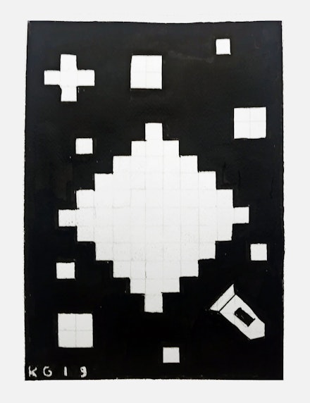
The introduction of color and retro motifs make clear that the motivation for all Grimes’s stylistic variations is formal appearance, just as it was for Jensen, or Blagdon, who placed abstract paintings at the base of the metal sculptures he assembled to generate energy and cure disease. According to the hierarchy of content over form, ideas come first, but what spurs the thinking are images themselves and the character of their organization. The demonstration of a theory and the proof of its validity is the aesthetic order of its images, their visual coherence. Without the images there is no grand scheme, no theory, no variations, only paranoia or longing. In the image, and only in the image, power and knowledge reside, and secrets are revealed. Yes, there are many words in Grimes’s work, but the messages reside in the visual design of those words. These are fields and forms united by the purpose of signifying. For all the clues and confirmations they seem to contain, it is ultimately up to viewers to decide, on the basis of the works’ splendor, whether they are in the presence of transcendent meaning or something earthbound and desperately groping.
